Tracking Claims: Enhancing Self-Service & User Experience
This project is designed to empower users with intuitive interfaces and streamlined processes, enabling efficient self-service and reducing reliance on phone support. By improving accessibility and usability, we aimed to enhance user confidence and satisfaction while optimizing operational efficiency.
Role : UX/UI Lead Designer
As the Lead Designer, I was responsible for user research, UX/UI design, copy refinement, and stakeholder presentations. I collaborated closely with developers, product managers, and claims consultants to ensure the final designs aligned with both user needs and business objectives.

What was the purpose
Self-Service
Empower users to self-service by providing intuitive navigation and comprehensive information, reducing reliance on phone support for routine inquiries.
At a Glance
Enhance user experience by offering detailed insights at a glance, enabling users to quickly access required information.
Progress Tracking
Improve usability by implementing features that allow users to accurately track progress, fostering a sense of control and transparency.
Support Relief
Alleviate phone support staff workload by addressing common queries through self-service functionalities, freeing up resources for more complex issues.
Claim Consolidation
Facilitate seamless navigation through different stages of a claim, consolidating relevant information in a single accessible platform for user convenience.
Integration
Streamline user interactions by integrating disparate claim stages into one cohesive interface, simplifying the process and enhancing overall efficiency.
Key Focus Areas
Claim Tracker Dashboard

BAU & Summary Page
Third-party Details

Document Upload

Header Redesign
Claim Tracker Dashboard
Purpose: Users needed a clear and structured way to track their claim status without contacting support.
Value: A redesigned timeline feature provided a visual representation of past, current, and upcoming claim actions. Integrated notifications ensured users stayed informed about pending tasks.
Impact: Reduced unnecessary support calls by over 50%, as users could now self-service effectively.
Original concepts
Uplifted designs
BAU & Summary Page
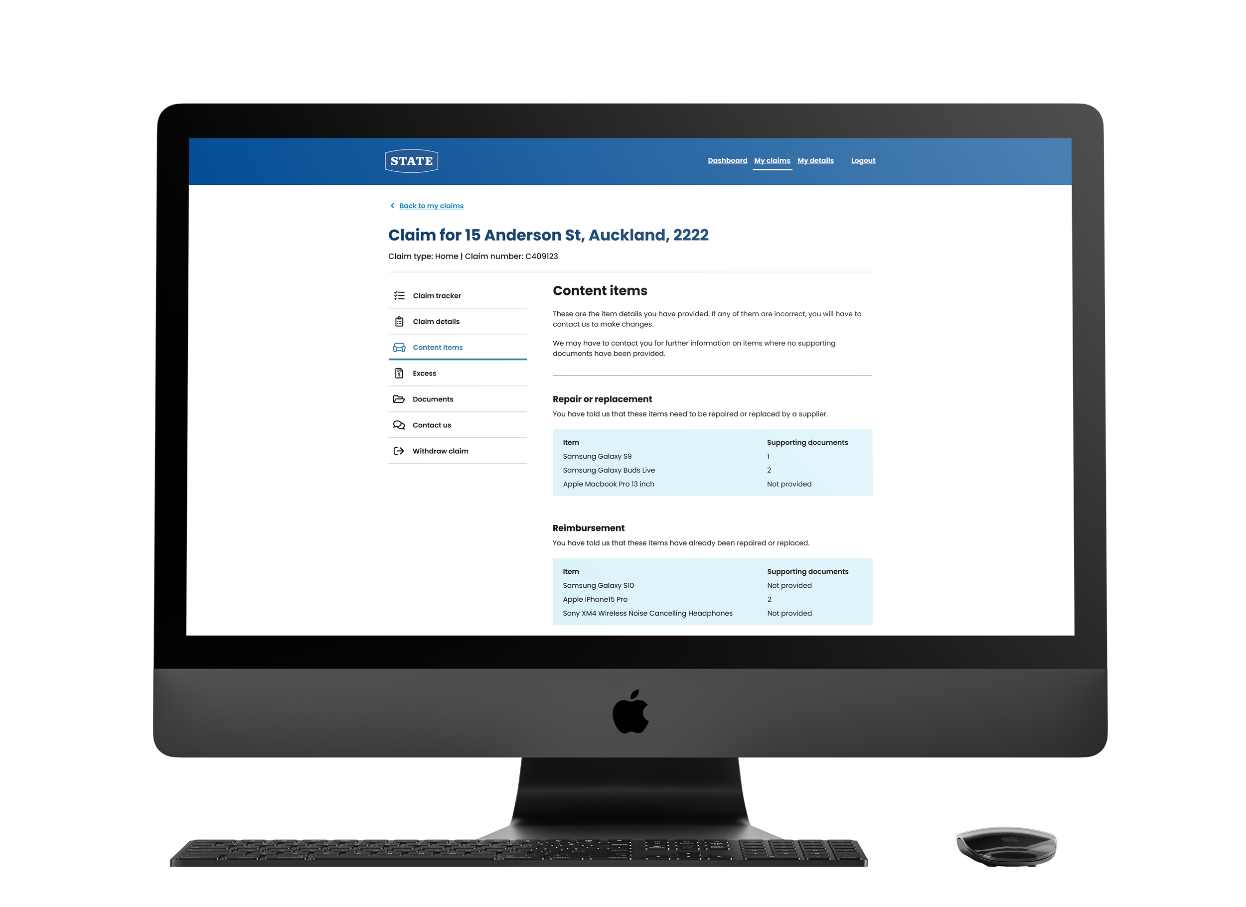
Purpose: Users needed a clear summary of their current claim status, along with structured guidance on what to expect next. Previously, the summary page itself was missing. This confused users who were returning to check on their previous submission which led to increased calls to support for clarification.
Value: The redesigned summary page offered concise and actionable guidance, while also serving a functional backend role—acting as a brief loading state to check for automated next steps. If the system could auto-verify the claim, users were seamlessly directed to the next step without needing to revisit the tracker, creating a fluid, uninterrupted experience.
Impact: Improved claim resolution time and reduced drop-offs due to uncertainty. Enabled a smoother, more seamless one-sit-down journey for users, and reduced reliance on support channels.

Original
Re-designed

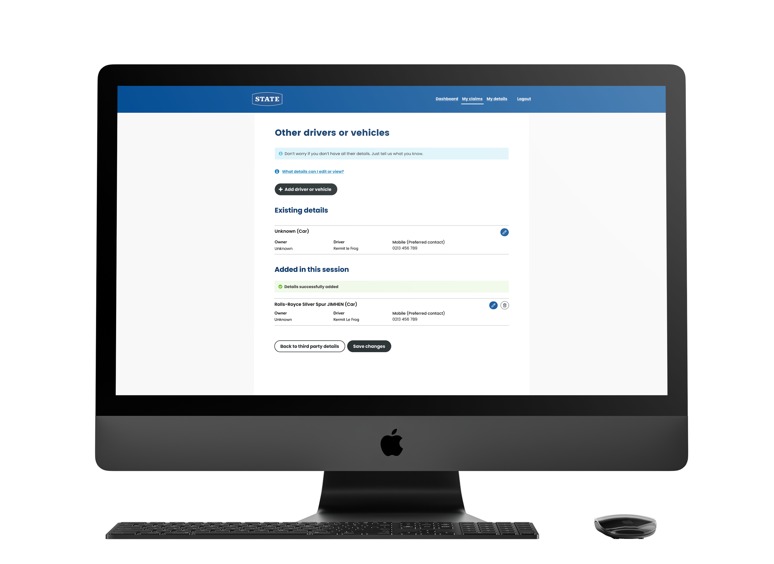
Third-Party Details Flow
Purpose: Users were unable to clearly indicate that there was third party involved in an incident. Customers had limited characters to describe the incident which led to claims handlers having to call customers to verify details, adding significant time and effort to the process.
Value: We introduced a dedicated flow where users add third-party details at any point during their claim, as long as it remained open. This included structured inputs for other drivers, witnesses, involved property, animals, or businesses. By introducing clear forms, inline guidance, and validation, we enabled customers to submit accurate, detailed information when they were ready—no longer restricted to the initial lodgement step.
This flexibility empowered customers while giving assessors the context needed to evaluate the claim more efficiently, particularly around decisions like excess waivers.
Impact: Reduced manual follow-ups by claims handlers, and improved claim assessment speed due to upfront information.
Original concepts


Final Designs


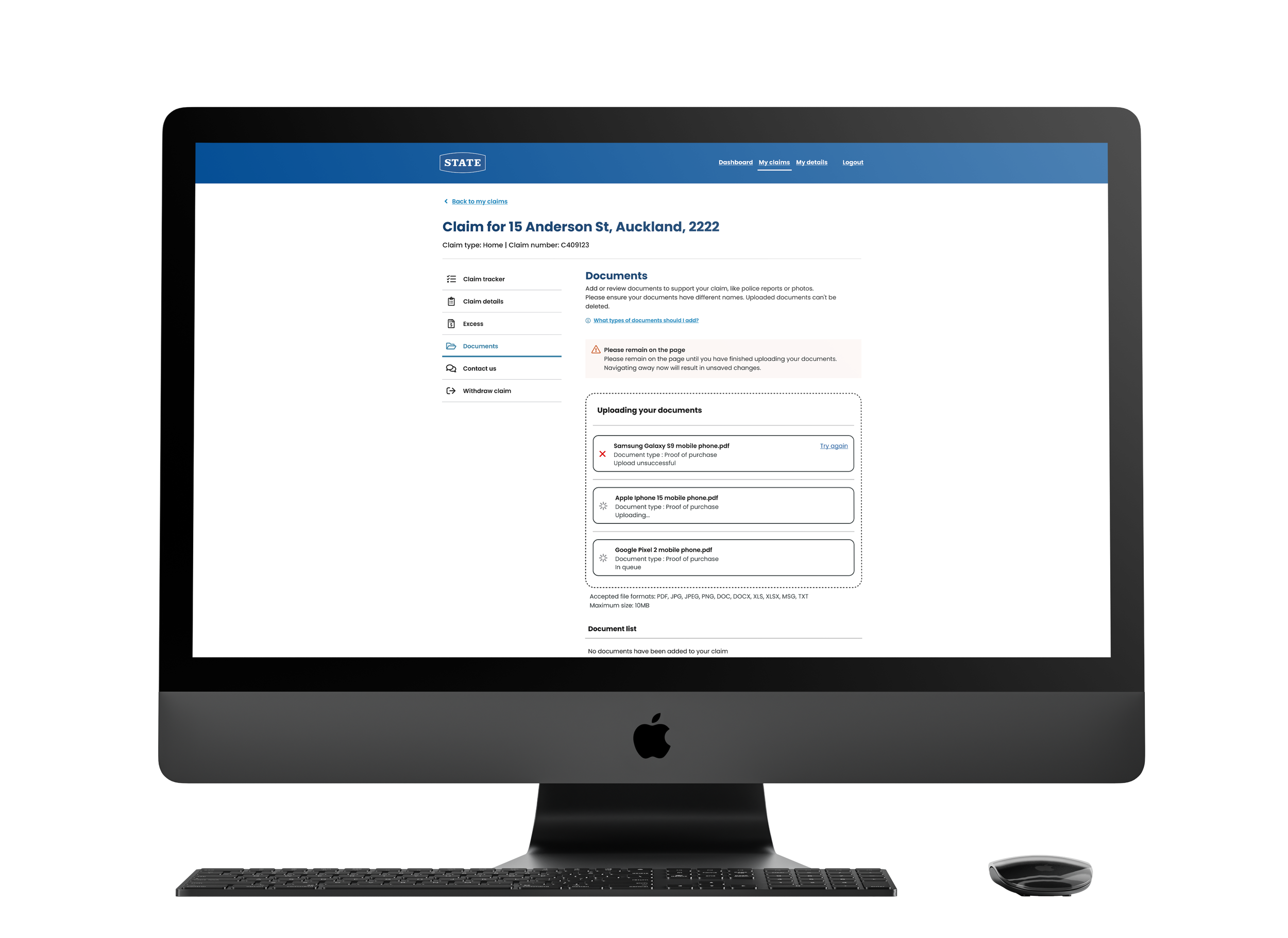
Document Upload
Purpose: While the upload feature existed, the original design lacked modern functionality and had not accounted for error states. This led to customer confusion, with unclear or overly technical error messages and invisible backend issues—such as files getting stuck in processing—that prompted users to submit the same document repeatedly.
Value: We introduced a complete redesign with a modern UI, built-in error handling, and helpful feedback throughout. The updated experience included file type validation, visible upload statuses, and a categorization system allowing users to label their documents more effectively. Bulk upload functionality and progress indicators made the process faster and more intuitive.
Impact: The redesign significantly improved internal processing by making document statuses visible and traceable on the backend. Claims consultants could now quickly verify which documents were submitted, their current status (e.g., processing, failed, or complete), and avoid delays caused by missing or duplicate uploads. Overall, the experience led to more accurate submissions, smoother claim assessments, and increased operational efficiency across the claims team.
Original designs


Final Designs


Header Redesign
Purpose: As backend systems migrated and marketing directions shifted, visual inconsistencies emerged across the claims experience. Our product sits within a broader ecosystem where header and footer colors are fixed—often clashing with our UI or making the interface feel overly white and washed out. This led to poor visual hierarchy and disjointed navigation across stages of the claims process.
Value: We redesigned the header to visually distinguish the claims experience while staying aligned with the broader platform constraints. The new design introduced a more youthful, modern look in line with updated brand guidelines. It also gave our product its own distinct identity, improving user orientation and cohesion across the journey.
Impact: Improved overall visual consistency and increased user satisfaction in post-test surveys. The refreshed header also enabled marketing to roll out brand-aligned visuals without disrupting usability.


