Mobile App: Driving Seamless Policy Management
The purpose of this project stream is to create a mobile-first experience that makes it easy for policyholders to access and manage their insurance products on the go. With over 50% of users interacting via mobile—whether to get a quote, lodge a claim, or check policy details—this stream focused on improving high-impact journeys to meet users where they are.
We identified a unique opportunity in the New Zealand market: we are the only insurance company with a mobile app. This distinction strengthens our brand's position and offers a strategic advantage in customer engagement and retention.
Role : UX Lead Designer
I led end-to-end UX and UI efforts across mobile feature enhancements, collaborating closely with cross-functional teams including product, engineering, and marketing. I also led usability testing and design iteration based on research and live analytics insights.

What was the purpose
Mobile-First Access
Support a growing mobile user base by providing seamless, responsive access to policy information, claims, and services.
Self-Service Empowerment
Allow users to complete core tasks—like checking coverage, renewing policies, and requesting assistance—without needing to call support.
Visibility at a Glance
Design experiences that let users view the most important information quickly, such as coverage limits, upcoming payments, or claim status.
Urgent Support Simplified
Ensure users can easily navigate high-stress journeys (e.g., after a crash or breakdown) with clear, intuitive guidance.
Brand Differentiation
Capitalise on our unique position as the only insurance mobile app in the New Zealand market, enhancing engagement and brand perception.
Design for Scalability
Create a flexible design system that aligns with marketing themes while adapting to backend infrastructure and evolving user needs.
Key Focus Areas
Policy Details Redesign

Policy Renewals

Free Roadside Rescue

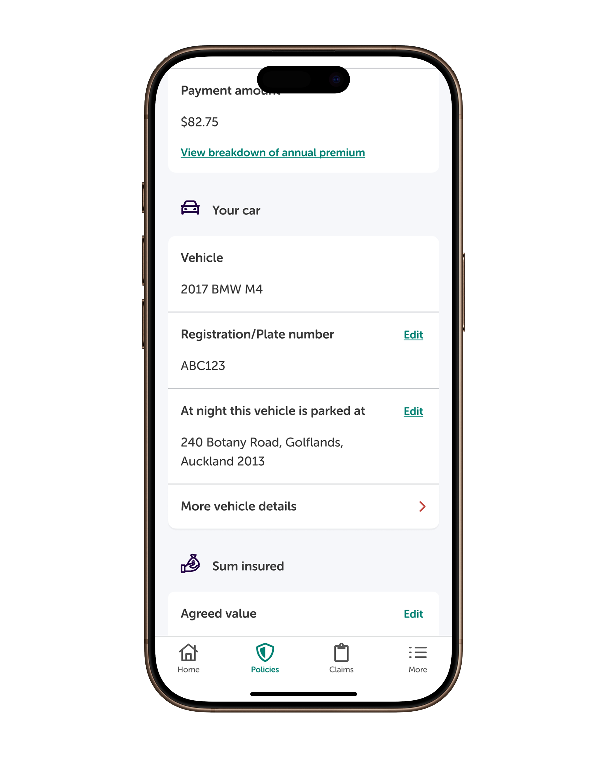
Policy Details Redesign
Purpose: Redesign the policy details page to make important information easy to find and act on, reducing confusion and dependence on customer service.
Value: A simplified, well-structured layout supported by plain language content helped users make informed decisions about their policy.
Current Pain Points:
Important updates were hidden, causing users to miss actions
Terminology was inconsistent, adding cognitive load
Dense layouts made the experience overwhelming
Most users only opened the app once or twice a year and have to re-familiarise themselves
Existing layouts didn’t match how users mentally grouped information
Original designs


Research Method
We conducted three rounds of research to better understand user needs:
5 users – Moderated usability testing on the initial concept
51 users – Unmoderated card sorting to reveal natural information groupings
7 users – Final round of usability testing with in-depth interviews
Key Insights
Card sorting revealed preferred groupings that didn't match the original information hierarchy
Users were confused by certain terms and where to find specific pieces of information
Users respond better to headings written in plain language
A successful redesign would need to be easy to re-learn with minimal cognitive effort
The Design Approach
Mapping the Information Architecture
We reorganised the content structure using the results of card sorting exercises to reflect user expectations. This included regrouping key sections and simplifying the overall layout.

Wireframe to High-Fidelity Evolution
We iterated through low to high fidelity designs with regular feedback rounds to ensure improvements matched user expectations.


Key Interaction Improvements
We redesigned how users interact with the policy details page by introducing mobile-friendly patterns and prioritising clarity:
Uplifted the policy card to show status more prominently at the top of the page.
Moved notifications to a global level, ensuring important actions aren’t missed, no matter where users are in the app.
Restructured content hierarchy based on card sorting insights, bringing the most sought-after details higher up on the screen.
Added quick links for frequent actions, reducing effort and improving usability.


Impact
Improved task success rates in user testing
Users were able to complete key tasks more efficiently and with fewer errors in the updated design.
Higher engagement with policy sections
The new layout encouraged users to interact more frequently with their policy details.
Greater user satisfaction with findability and clarity
Users reported higher satisfaction with the ease of finding and understanding their policy information.
A springboard for future design enhancements
The redesigned policy page provides a foundation for developing more native, seamless mobile solutions and reducing reliance on web flows.
Policy Renewals
Purpose: The current renewal flow is complicated and fragmented, with inconsistent alerts and confusing copy. Customers are often handed over to a web view that restarts the process, causing frustration.
Value: Improve trust and retention by providing a smooth and transparent renewal experience. A simplified, more current, and native renewal flow will ensure that customers feel confident and encouraged to renew their policies directly in the app.
Current Pain Points:
The renewal journey felt inconsistent and disjointed.
Users were redirected to a web view, causing frustration due to the process restarting.
The UI was inconsistent, leading to confusion.
There were too many clicks and steps before users could complete their renewal.
Original designs

Research Method
We conducted several rounds of research to better understand user needs:
Competitor Analysis – Analysed competitor renewal flows to identify industry best practices.
Cross-Check with Web Flow – Compared the mobile app renewal process with the web version to ensure consistency.
User Survey (30 participants) – Gathered insights into users' renewal behaviours and expectations.
Usability Testing (7 users) – Conducted interviews and usability testing on the final concepts to validate design changes and identify pain points.
Key Insights
Most expect a renewal reminder at least a month in advance.
A few users mentioned that they don’t remember receiving communication or weren’t sure. They expressed a desire for clearer and more noticeable communication.
Users often assume premiums increase but still want to understand why.
Users want transparency around price increases to make informed decisions.
Many want to review their renewal before accepting and some are open to switching providers.
Some users feel the need to shop around for a better price, especially given the rising cost of living, making them more likely to consider switching providers.
Few users had their insurance app downloaded, with some unaware of it entirely.
Some users were aware that their insurance provider had an app, but others weren't sure.


The Design Approach
Simplifying the Renewals Journey
The previous renewal flow redirected users to a web view, often restarting the journey and causing confusion. We reduced the number of steps needed to finish a renewal and included key actions—like native payments—into the flow. While changes to policy details still link out to the web, the core renewal actions now feel more connected and easy to follow. Our goal was to help users feel confident reviewing and renewing their policy without needing to call for help.


Improved Notifications and Alerts
We reworked alerts and reminders to be clearer, more accurate, and less pushy. The updated approach aligns messaging across the app, avoids pressure to pay before reviewing details, and introduces confirmation alerts once a renewal is complete—giving users the clarity and reassurance they expect.


Leveraging the Policy Details Redesign
We used the redesigned policy details screens as a foundation to speed up and strengthen the renewals experience. Because we had already invested in clear layouts, updated IA, and accessible components, we were able to extend this work into the renewal flow without starting from scratch. This ensured visual and functional consistency, accelerated design delivery, and reinforced a seamless app experience


Impact
Higher in-app renewal completion
A more streamlined, native flow made it easier for users to review and renew their policies directly in the app.
Fewer support calls about renewals
Clearer copy, consistent alerts, and a reduced step count meant fewer users needed to call for help.
Improved user confidence and satisfaction
Users felt more in control of their renewal decisions thanks to better transparency and simpler design.
Foundation for future mobile enhancements
By aligning with our modern design system, the new flow sets the stage for scalable, mobile-first improvements.
Free Roadside Rescue
Purpose
Customers who qualified for complimentary roadside rescue—typically through new or renewed policies—initially received a one-time dashboard alert. However, once dismissed, the benefit details were no longer visible anywhere in the app, creating confusion and missed value.
Value
We redesigned the experience to ensure this key offer didn’t get lost. By relocating the information into the policy details screen, we made it easier for users to rediscover and understand the benefit, even after the initial alert had been dismissed. This provided better transparency and long-term access to entitlements.
Impact
Improved visibility and trust in the roadside rescue offer, reduced support queries related to benefit confusion, and strengthened the overall perception of added value within the app experience.


